When Perfectly Paired approached me to create an identity, logo, and branding for their speed dating business I knew it would be a match made in branding heaven. Perfectly Paired wanted something that was both romantic and spoke to the most important component of dating: communication.
Considerations
The branding for Perfectly Paired needed to give a warm and inviting feeling upon first glance. Perfectly Paired also wanted people to truly understand the value of communicating with one another in settings like her speed dating events. Because the events give attendees only a few moments to get to know one another, the branding had to be concise and understood just as quickly.
Action
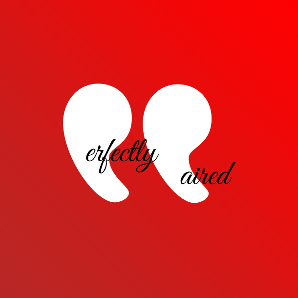
To give someone a warm and welcoming feeling, we chose red hues. The ombre effect gives the eyes a place to start and finish. The transition from Rose (#E3242B) to Crimson (#B90E0A) illustrates the deepening of love and relationship over time. The quotation mark used in the design is meant to serve two purposes. 1. to serve as the p’s in Perfectly Paired. 2. to call out the importance of communication.
Results
The result of this design is a warm and inviting logo and brand. But most importantly, another satisfied customer and lifelong client.